

Last week’s post was all about Corsi, one of hockey’s answers to the emerging world of advanced sports analytics. This week’s post is about another advanced hockey statistic: Fenwick.
Fenwick and Corsi are very closely related. Fenwick is the same as Corsi except it does not include blocked shot attempts; so it is all shots on goal and missed shots on goal. Essentially Corsi is all shots that take place and Fenwick is all shots that take place which actually get to the goal.
As in last week’s post, I’ll be looking into the Fenwick stats of the more successful teams last season and historically to see if Fenwick is a good indicator of a team’s success.
Below are team’s Fenwick For (FF) per 60 minutes subtracted by their Fenwick Against (FA) per 60 minutes and how it relates to a team’s points. The color represent the team’s playoff spot last season. The light blue shaded area is for positive Fenwick per 60 minutes and the light orange is for negative. The linear trend line is added as well.

As with Corsi, there was a positive relationship between Fenwick and the number of team points. On average, one additional FF event lead to an additional 2 points for that team.
Every team above the trend line made the playoffs last season. Four teams below the trend line also made the playoffs: Colorado Avalanche, Vegas Golden Knights, San Jose Sharks, and the Carolina Hurricanes.
With the exception of the Colorado Avalanche, the other teams had the three highest Fenwick differentials per 60 minutes.
Below is every team’s Fenwick per 60 minutes and how it relates to a team’s number of points since the 2007-2008 season. I excluded the 2013 season which was shortened due to the lockout. The light blue shaded area is for positive Fenwick per 60 minutes and the light orange is for negative. The linear trend line is added as well.
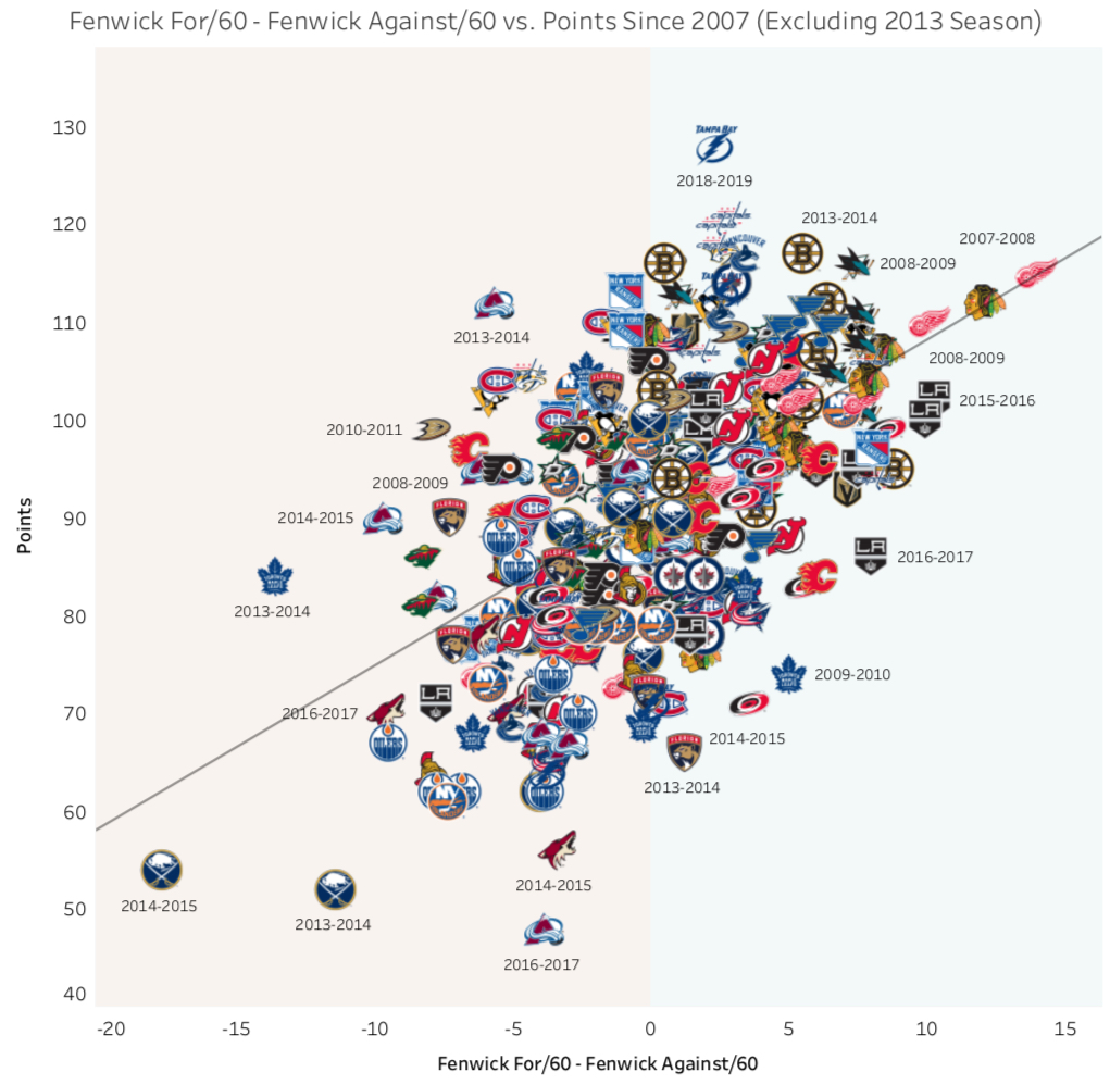
On average, since 2007, an additional Fenwick event per 60 minutes equates to about 1.5 more points for that team, which is less than last season’s 2 points.
The extremes of the Fenwick measure are some very dominant and very poor teams. The 2014-15 and 2013-14 Buffalo Sabers certainly take the cake for some of the worst teams recently. The 2009-10 Chicago Blackhawks and 2007-2008 Detroit Red Wings were both Stanley Cup Champion teams.
The final graphic shows every teams FF and FA per 60 minutes since 2007 and that teams point percentage – that is the teams percentage of total possible points available. Average lines for Fenwick For and Against were added for reference.

What sticks out are the top left and bottom right quadrants. These would be the “worst” (top left) and “best” (bottom right) based on Fenwick differential.
We see a larger concentration of orange dots (less than 50% of points) in the top left and a larger concentration of blue dots (more than 50% of points) in the bottom right. The other two quadrants have a fairly even mix of both color dots.
As with Corsi, Fenwick is not the only indicator of a successful hockey team, especially for those in the middle of the pack. As shown in the graphics above, the teams with the largest differentials (either positive or negative) tend to fair better or worse than those in the middle.
This is especially supported by the last graphic where the top left and bottom right quadrants have the higher concentration of orange and blue dots, respectively, but the other two quadrants have a mix.

Pingback: Predicting NHL Hockey Games – The Commute Sports