

This week I kept with the theme of predictions, but rather than predicting what teams will win a game I decided to look into predicting how many points a college basketball team would score (I did something similar to this a while back with hockey).
This article looks at individual Division 1 college basketball game data from this past season. The goal is to accurately predict the number of points a team will score in a game. Some of the stats used include field goal attempt differential, field goal percentage, opponent free throw attempts, just to name a few.
Throughout the article I look at inputing different sets of data to get the most accurate results. These different inputs are different sets of moving averages from previous games. For example – one input is the exponential moving average of the previous three games. These numbers are put into the models to predict what the following game would be. In the graphics the three inputs are referred to as Input 1, Input 2, and Input 3.
The first set of graphics are histograms that look at the point differentials between the three inputs. Each bar is the number of games that input predicted would have that size of point differential. The point differential is the the actual number of points a team scored minus what the model predicted it would score.

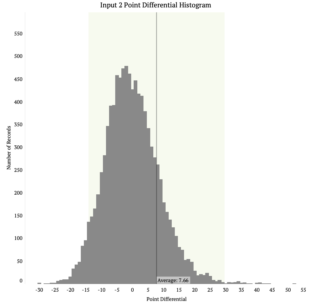
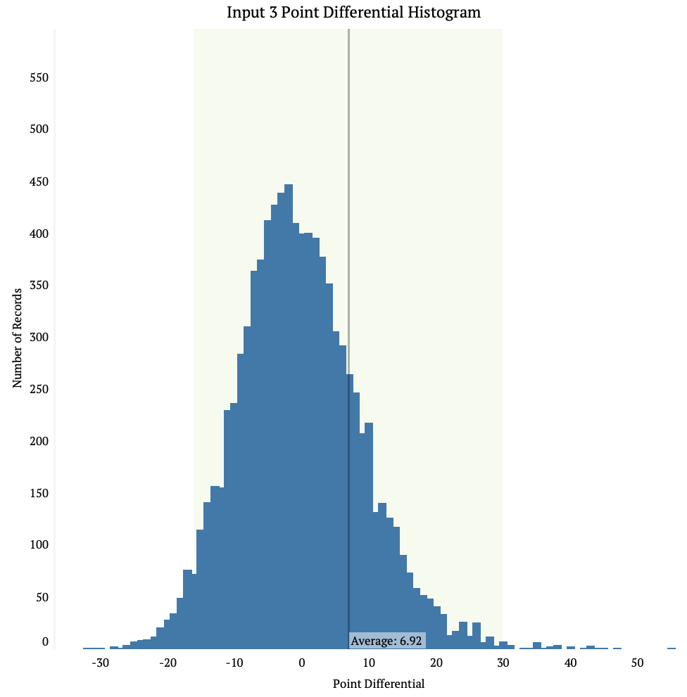
Input 1 has the smallest average point differential of the three at 6.73. It also has the smallest standard deviation. Inputs 2 and 3 you can see have longer tails on the end of the data and shorter peaks. This means there is more room for error when using these input methods.
In all data input methods we see the average is to the right of the high point on the chart, this means all the models have a tendency to under estimate how many points teams will score. This also means there are some major differences between the model and the actual score.
The next graphic looks at the average number of points teams scored on a given day as well as the average number of points the inputs predicted would’ve happened on that day. Note that this graphic is just a way to summarize the models compared to the actual events – keep in mind that on any given day many games are being played and the model is predicting a score for all of them.

We see above that the model is usually less sporadic than the actual average score. The different inputs are almost always on the inside of the actual score. It’s tough to say what this is attributed to.
The next graphic looks at the average point differential by day. The point differential is calculated by taking the actual score of the game and subtracting it by the predicted score of the game. A positive number means the model under-predicted the score, while a negative number means the model over-predicted it.

Clearly there was a lot of variance between the model at the beginning of the season, but as the season went on they came closer to one another. It seems that Input 1 is always on the inside though, which makes sense given that it has the smallest standard deviation of the three different inputs.
The final graphic shows a game by game comparison for an actual team (Kansas State). This gives a better picture of what the model is doing for every game. Below, the powercat logo is the actual score of Kansas State on that day, and the colored dots represent what the models predicted would be the score.
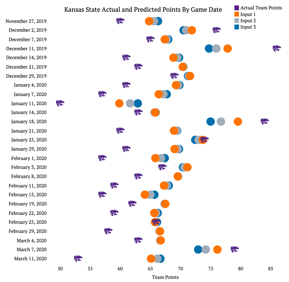
You can see above that Kansas State generally under performed relative to the model. In 21 of the 27 games the wildcats scored less points than all of the inputs predicted. In one game though (2/25/2020) the model was extremely accurate with what the score would be.
This graphic does a good job demonstrating that models are just that: models, not the real life event. Even though you make them as good as you can, there is still an inherent variability and errors with in them, especially when it comes to sports.

You should try the last graph with a top five team.
LikeLike