

This week’s post is going to be very simple, kind of random, but things that I think are interesting, and help explain the 2019-2020 NCAA Basketball season so far.
Note that most data in this post is as of 2/9/2020.
The first image is simply a visual representation of the AP Top 25 Poll as of 2/10/2020. I’ve charted lines to show the ranking journey for each team currently ranked.

No changes in the top 4 teams since the January 20th poll and no changes in the top 9 since February 3rd. Marquette made its first appearance in the AP rankings at 18 this week.
Texas Tech returned to the poll on Monday. They were ranked as high as 11, became unranked, were ranked again as high as 18, went unranked again for two weeks, and are now back in it.
Of the 25 teams currently ranked, only 13 were ranked before the season started, 3 of which are currently ranked 10th or better (San Diego State, Dayton, Florida State).
The second graphic simply looks at median points per game by conference. The colors below will be used in the other graphics as well – they represent the conference. Non-power five conferences are in a shade of blue, while the power five conferences are in a shade of orange.

The WCC scores the most points at 76.10 while the Atlantic Sun scores the least at 66.50. What’s super interesting about this is all the power five conferences are within 6 spots of one another, having a difference of only 1.58 points.
The third graphic looks at a team’s free throws per field goal attempt rate and compares it to their win percent. So if a team makes 10 free throws in a game and attempts 100 field goals, their free throws per field goal attempt rate would be 0.1. The linear trend line is added as well.
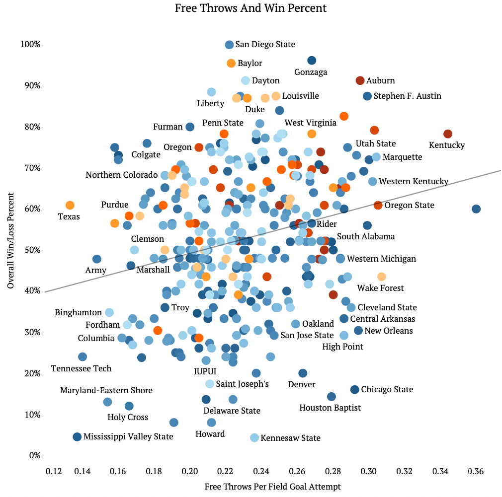
Not too surprising to see a positive correlation between the two variables – on average as teams have more made free throws per field goal attempts, they have a better win percentage.
What is really interesting though is the numbers behind the trend line. The relationship is statistically significant, but there is a weak correlation between the two. This means that while these two items move in the same direction, free throws per field goal attempts does not really explain the increased win percentage.
But, think about what happens when a team gets to shoot free throws. Obviously there is a potential for points (which this graphic assumes), but also it means the other team has fouled. Perhaps this means that teams are winning more not because if the made free throws, but rather other teams are fouling more.
The final graphic again looks at a team’s win percentage, but this time we are comparing it to their effective field goal percentage, which takes into effect the fact that a 3-point attempt is worth more than a 2-point attempt. The linear trend line is added as well.
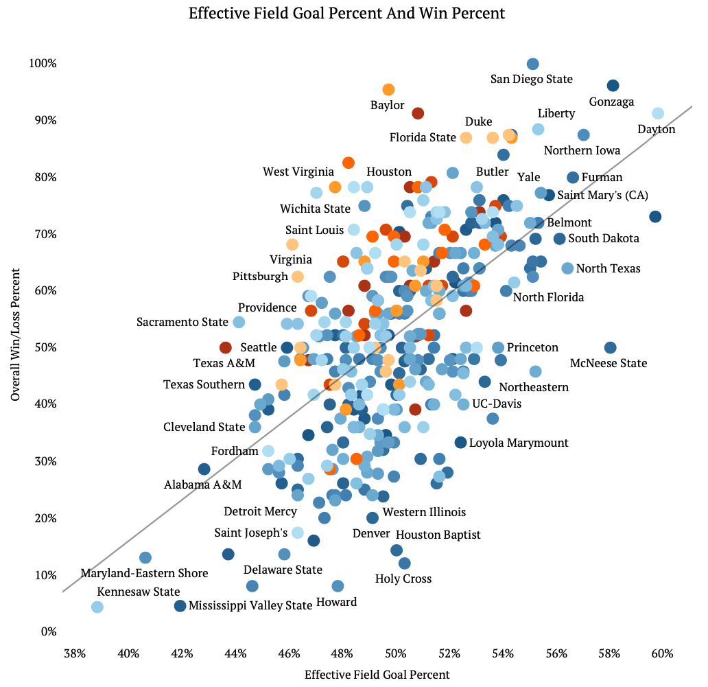
Again, there is a positive correlation between the variables – one would think that a team who shoots well will generally win more games than a team who shoots poorly. This time, we see not only a statistically significant relationship, but also a stronger explanatory relationship between the two variables.
Its interesting though because Baylor, who currently is the number 1 team in the country, has an effective field goal percent of 50%, while McNeese State has a win percent of 50% and an effective field goal percent towards the top with 58%.

Kennesaw State better get its act together!
LikeLiked by 1 person