

After over a year since my last article (February 2021), I decided to return with a quick and simple tutorial for those interested in creating some of my shot map graphics in python.
I’ll be creating an expected goal (xGoal) shot map for an individual player compared to the league average. Essentially this will show where a player has a better chance of scoring when compared to the rest of the NHL.
First we will need to download the data. I am getting all of my shot data from moneypuck.com. They provide all the the data in .csv format free to download. For this tutorial I am looking at the last two season’s in the NHL (2020 & 2021).
data: https://moneypuck.com/data.htm
After downloading, lets have a quick look at the columns we will be using.
#Note that import_shot_data is a function I created - same data as found at moneypuck.com
#https://moneypuck.com/data.htm

years = [2020,2021]
data = import_shot_data(years)

data[['shooterName','xGoal','xCordAdjusted','yCordAdjusted']].head()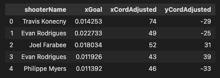
Second, let’s do some quick data cleaning. I want to look only at shots that took place in 5 v 5 play (no power plays), no empty net shots, no shots that took place across the ice, and none from behind the net. After cleaning, lets look at some quick statistics of the data
data = data[(data['awaySkatersOnIce'] == 5) & (data['homeSkatersOnIce'] == 5)]data = data[data['shotDistance'] <= 89]
data = data[data['shotOnEmptyNet'] == 0]
data = data[data['xCordAdjusted'] <= 89]

print("xGoals Max {:.2f}".format(data['xGoal'].max()))
print("xGoals Mean {:.2f}".format(data['xGoal'].mean()))
print("X Cords: {}, {}".format(data['xCordAdjusted'].min(),data['xCordAdjusted'].max()))
print("Y Cords: {}, {}".format(data['yCordAdjusted'].min(),data['yCordAdjusted'].max()))
You can see that the highest xGoal was a .79, meaning it had a 79% chance of being a goal. The average was a 0.06. The x and y coordinates have been adjusted already to show every shot as if they took place on the right side of the ice – this will allow for easier charting.
At this point we are able to start plotting the data and begin our analysis. Using numpy we can create an array of the xGoal values from our data. SciPy’s griddata will allow us to fill empty gaps in the data to “complete” the array. Finally, I am going to set any negative xGoal values to 0 because you cannot have a negative xGoal value (but griddata does not know this).
import numpy as np
from scipy.interpolate import griddata
import matplotlib.pyplot as plt

[x,y] = np.round(np.meshgrid(np.linspace(0,100,100),np.linspace(-42.5,42.5,85)))
xgoals = griddata((data['xCordAdjusted'],data['yCordAdjusted']),data['xGoal'],(x,y),method='cubic',fill_value=0)
xgoals = np.where(xgoals < 0,0,xgoals)

fig = plt.figure(figsize=(10,12), facecolor='w', edgecolor='k')
plt.imshow(xgoals,origin = 'lower')
plt.colorbar(orientation = 'horizontal', pad = 0.05)
plt.title('xGoal Array',fontdict={'fontsize': 15})
plt.show()
All I did above is plotted the individual xGoal values at each x and y coordinate. This is cool, but we will need to do some further work for it to be useful to us. Right now we have very choppy data. Smoothing it will allow us to see what a more average xGoal map will be.
SciPy has some great numpy array smoothing abilities. Here I am going to use gaussian_filter on our ‘xgoals’ array.
from scipy.ndimage import gaussian_filter
xgoals_smooth = gaussian_filter(xgoals,sigma = 3)

fig = plt.figure(figsize=(10,12), facecolor='w', edgecolor='k')
plt.imshow(xgoals_smooth,origin = 'lower')
plt.colorbar(orientation = 'horizontal', pad = 0.05)
plt.title('xGoal Smoothed Array',fontdict={'fontsize': 15})
plt.show()
Notice that this significantly decreased our maximum value. We went from a 0.79 to about a 0.23 xGoal.
At this point we have an average xGoal grid in the NHL. It makes sense too, shots that occur right around the goal have a higher chance of going in. Shots farther out have a smaller chance.
Now, I want to do the same thing for an individual player and see how he compares to the league. This will show us where he gets better and worse chances of scoring from.
Let’s run this analysis for Connor McDavid, the best player in the NHL (not up for debate). The only thing we will change is the data. First we will filter by just Connor’s shots, then we will run the same steps as before.
player_name = 'Connor McDavid'
player_shots = data[data['shooterName'] == player_name]

[x,y] = np.round(np.meshgrid(np.linspace(0,100,100),np.linspace(-42.5,42.5,85)))
xgoals_player = griddata((player_shots['xCordAdjusted'],player_shots['yCordAdjusted']),player_shots['xGoal'],(x,y),method='cubic',fill_value=0)
xgoals_player = np.where(xgoals_player < 0,0,xgoals_player)

player_shots_smooth = gaussian_filter(xgoals_player,sigma = 3)

fig = plt.figure(figsize=(10,12), facecolor='w', edgecolor='k')
plt.imshow(player_shots_smooth,origin = 'lower')
plt.colorbar(orientation = 'horizontal', pad = 0.05)
plt.title(player_name + ' xGoal Smoothed Array',fontdict={'fontsize': 15})
plt.show()
This looks good. There are some clear differences from the average NHL, but to get a better sense of where Connor is better and worse lets take the difference of the two arrays.
difference = player_shots_smooth - xgoals_smooth

fig = plt.figure(figsize=(10,12), facecolor='w', edgecolor='k')
plt.imshow(difference,origin = 'lower')
plt.colorbar(orientation = 'horizontal', pad = 0.05)
plt.title(player_name + ' vs Leage xGoal',fontdict={'fontsize': 15})
plt.show()
This is certainly better, but still hard to read as there is no real reference to where on the ice he is better or worse. Lets change the color, do some small data cleaning, and add in the NHL rink lines (I have a function to do this called create_rink, but there are many ways to accomplish this).
import matplotlib as mpl
difference = difference[:,:90]

fig, ax = plt.subplots(1,1, figsize=(10,12), facecolor='w', edgecolor='k')
create_rink(ax, plot_half=True, board_radius= 25, alpha = .9)
ax = ax.imshow(difference, extent = (0,89,-42.5,42.5),cmap='bwr', origin = 'lower', norm = mpl.colors.Normalize(vmin=-0.05, vmax=0.05))
fig.colorbar(ax, orientation="horizontal",pad = 0.05)
plt.title(player_name + ' vs Leage xGoal',fontdict={'fontsize': 15})
plt.axis('off')
plt.show()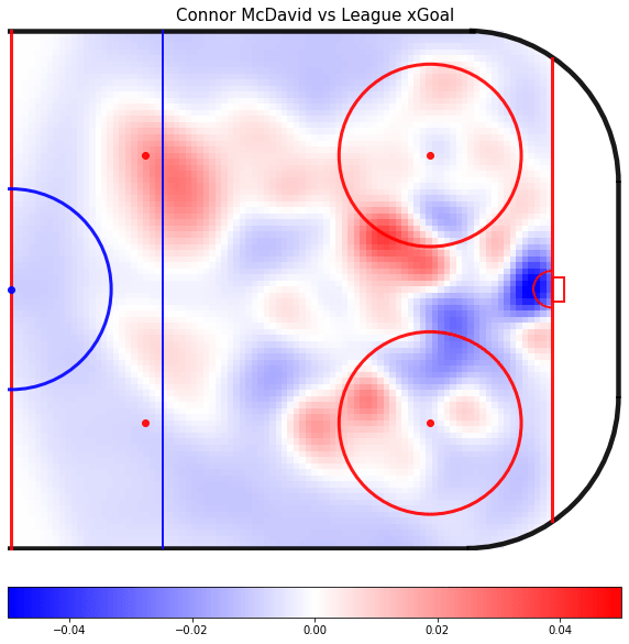
Now we can clearly see how he compares. Around the net, in 5 v 5 he is below average, but when you move him to the top of either circles and in the top of the slot Connor really shines. At those points he has almost a 5% higher xGoal than the rest of the league.
Another way to visualize this would be with contour maps.
difference = player_shots_smooth - xgoals_smooth
difference = remove_shots(difference, fill_val = 0)

data_min= difference.min()#data['player_xGoal_diff'].min()/11
data_max= difference.max()#data['player_xGoal_diff'].max()/11
mid_val= difference.mean()

if abs(data_min) > data_max:
    data_max = data_min * -1
elif data_max > abs(data_min):
    data_min = data_max * -1

fig, ax = plt.subplots(1,1, figsize=(10,12), facecolor='w', edgecolor='k')
create_rink(ax, plot_half=True, board_radius= 25, alpha = .9)
ax = ax.contourf(x,y,difference,alpha = 1.0, cmap='bwr',
        levels = np.linspace(data_min,data_max,12),
        vmin=data_min,
        vmax=data_max,
            )
plt.axis('off')
plt.title(player_name + ' vs Leage xGoal',fontdict={'fontsize': 15})
fig.colorbar(ax, orientation="horizontal",pad = 0.05)
plt.show()
This is showing the exact same data, just helps visually as it defines clear boundaries between the colors.
And finally, making some other visual changes we get to the final product.

This is just a quick glance into some of the visuals and analysis you can create very easily with python!

Pingback: Commute Sports NHL xGoal Model – The Commute Sports
This is awesome! Could you do a quick tutorial on your create_rink() function?
LikeLike
Just uploaded it to my git hub. Link in top right, or: https://github.com/gredelsheimer/RandomCode
LikeLike
Sweet, thank you! I will show you my project I make with it once Im done
LikeLike
I forgot to ask about import_shot_data() as well. Do you import it from MoneyPuck as a csv file or are you scraping it and putting it in JSON or something?
LikeLike
Its just a function I wrote to import the data into my script. I saved off the .csvs and it imports it as a data frame.
LikeLike