

After I completed my analysis of Tuukka Rask I decided to dig a little deeper into the goals that were scored last season in the NHL, on all goalies. I created these three fairly simple charts this afternoon that do a good job showing the breakdown of all goals.
Its certainly worth giving a shoutout to moneypuck.com. All the data from this post and last came from them (I do post all my sources at the end of my posts too).
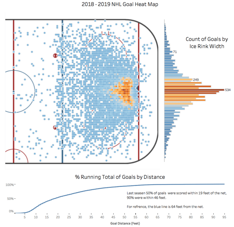
The first graphic is a heat map of every goal scored last season. The light blue is the lowest count of goals in that spot (1 goal) and the darkest orange, right in front of the goal, is the position on the ice which scored the most goals last season (42 goals).
It’s probably no surprise to see a high concentration of goals around the net, but what I find interesting are the small pockets outside of that cluster. For example the two orange dots up and to the left of the goal. Obviously players stand there consistently, but it’s a surprise to see enough goals from that exact spot to be orange rather than blue.
To the right of the heat map is a count of the goals by the ice rink’s width (east/west position). So the top and bottom of the bars represent where the boards are and the middle represents the middle of the ice (go figure). It’s crazy to see how quickly the goals accumulate as players move towards the center of the ice. Last season, 459 goals were scored from the center of the ice.
The final chart shows the distance in which goals were scored; its a running total by the distance from the net (in feet). You can see the total percentage climbs quickly. 50% of all goals were within 19 feet of the net and 90% of goals were within 18 feet of the blue line.
If you like this sort of analysis or have any questions, comments, ideas let me know! I would be happy to hear from you.
Data: www.moneypuck.com

Pingback: NHL Goalie Analysis – The Commute Sports
Pingback: 2019-2020 NHL Shot Analysis – The Commute Sports
Pingback: NHL Interactive Shot Map – The Commute Sports
Cool heat map! Any advice on how to create a heat map with this cool rink in the background in r?
thanks.
Thomas
LikeLike