

This week’s post is all about analyzing goalies and shot data from last season (2018-2019). I wrote a post about the goals scored last season a few weeks ago, but I wanted to go into more detail on all shots and misses in addition to goals. Additionally, I wanted to analyze particular goalies and see how they compared to others.
In all the graphics below, I am looking at goalies that played at least 41 games last season, which is to say they started half the games for their teams.
Before we jump into the analysis, I want to explain the “shot angle” measure that will be used. This is exactly what it sounds like, it is the angle at which the goal, shot, or miss came from; this can range from -90 to 90. Imagine you are standing where the goalie does on the ice. Straight ahead of you would be 0 degrees, perfectly right would be 90, and perfectly left would be -90. I created a picture below that does a good job visualizing it.

The first thing I analyzed was if teams shoot more towards the glove (left) or the blocker (right) side depending on the goalie. To do this, I graphed the median angle goalies get shots from.
Below are the results. Every circle represents a different shot on the goalie. The purple are goals, pink are misses, and the reddish pink are shots. I also added the median angle for all goalies, those are the red lines below.
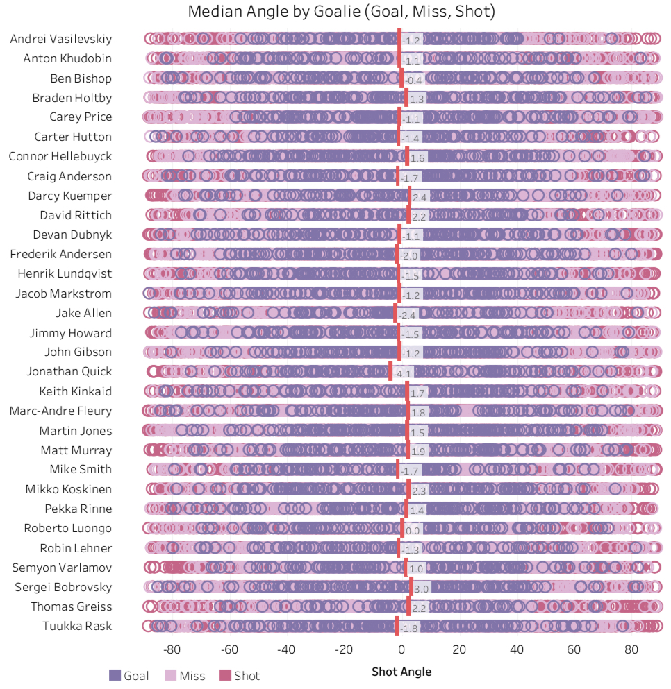
As you may imagine, all goalies have median angles fairly close to 0, in fact Roberto Luongo of the Florida Panthers is exactly 0, meaning he sees the same number of shots from his left and right side.
Jonathan Quick from the LA Kings has the farthest left side angle at -4.1 and Sergei Bobrovsky from the Columbus Blue Jackets has the farthest to the right at 3. Overall though, we see the large majority of goalies had a median angle of within -2 and 2. 17 of the 31 goalies (54.8%) have medians on their left side, meaning shots come from the right wing more often than the left wing.
The second graphic is very similar to the first, but I removed all shots and misses, meaning only goals are shown below. Also, I colored the circles based on their individual “Expected Goal” value. Red means it had a high value, blue meant it was low. It’s worth saying though that all the circles below are goals, so even a blue circle with a low expected goal value still ended up being a goal. Like above, I also added the median line in per goalie.
The third graphic is the same as the one below, but it is just the median lines, no circles at all.
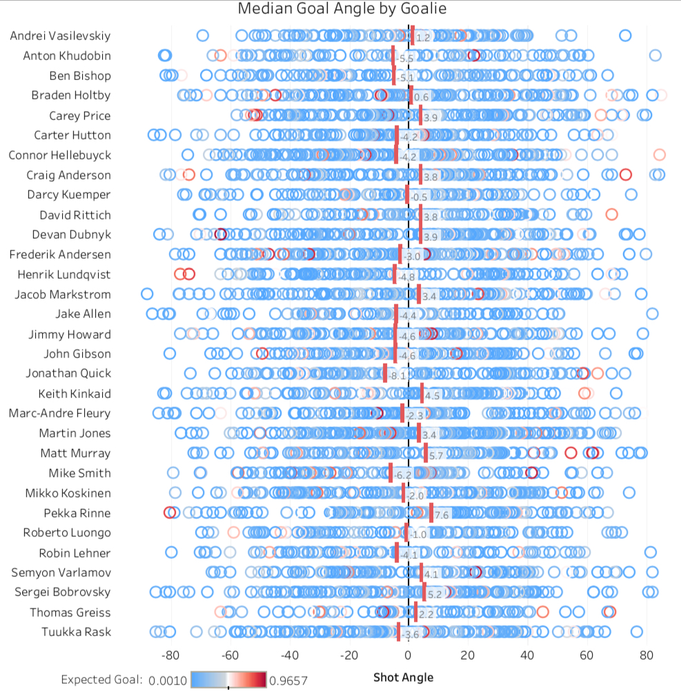

There is a much bigger spread when looking at goals only, which does not surprise me too much. Obviously shots come at goalies from all over the ice, but goalies tend to have weaker sides, thus the bigger range of median angles.
What stands out immediately are the outliers. Again, Jonathan Quick has the largest left side goal angle of -8.1, meaning most of the goals he allowed last season was on his glove side.
The opposite of that was Pekka Rinne from the Nashville Predators who had a median goal angle of 7.6, meaning most of the goals he allowed were from his blocker side.
Only 4 of the 31 goalies had median goal angles within -2 to 2: Andrei Vasilevski, Braden Holtby, Darcy Kuemper, and Roberto Luongo. This is ideal because it means the offense does not have a better chance of scoring on one side of the goalie vs the other.
What an offense wants to see (and what a defense doesn’t) is a median goal angle thats off to the side. For example, when going up against Pekka Rinne, most shots should be from the left wing, or on his blocker side, because the numbers show he gives up more goals on this side.
The final graphic is a histogram of where the three shot categories (goals, shots, misses) come from. The higher the bar means more goals, shots, or misses came from that angle. I also added the median angle for each of these events.

The median angle for goals, shots, and misses are all within -2 to 2, which makes complete sense because most shots come towards center ice (I looked at this in another post).
What interests me are the different patterns between the three categories. Starting with goals, there is a big concentration of goals at the 0 mark, meaning right in front of the goalie. Additionally, there are two peaks at the 27 and the 45 mark. These angles correspond to about the top of the right circle and the center of the circle, respectively. Clearly, a large amount of left wings and centers are getting goals from these areas.
Shots are interesting because there is not a very large peak or trough at any of the shot angle values, meaning shots are taken at all angles evenly towards the goalie. Misses definitely has a higher concentration towards the 0 mark, but is still fairly spread out in frequency between about -35 to 35.
Data: moneypuck.com

Pingback: NHL Shooter Analysis – The Commute Sports
Pingback: NHL Interactive Shot Map – The Commute Sports